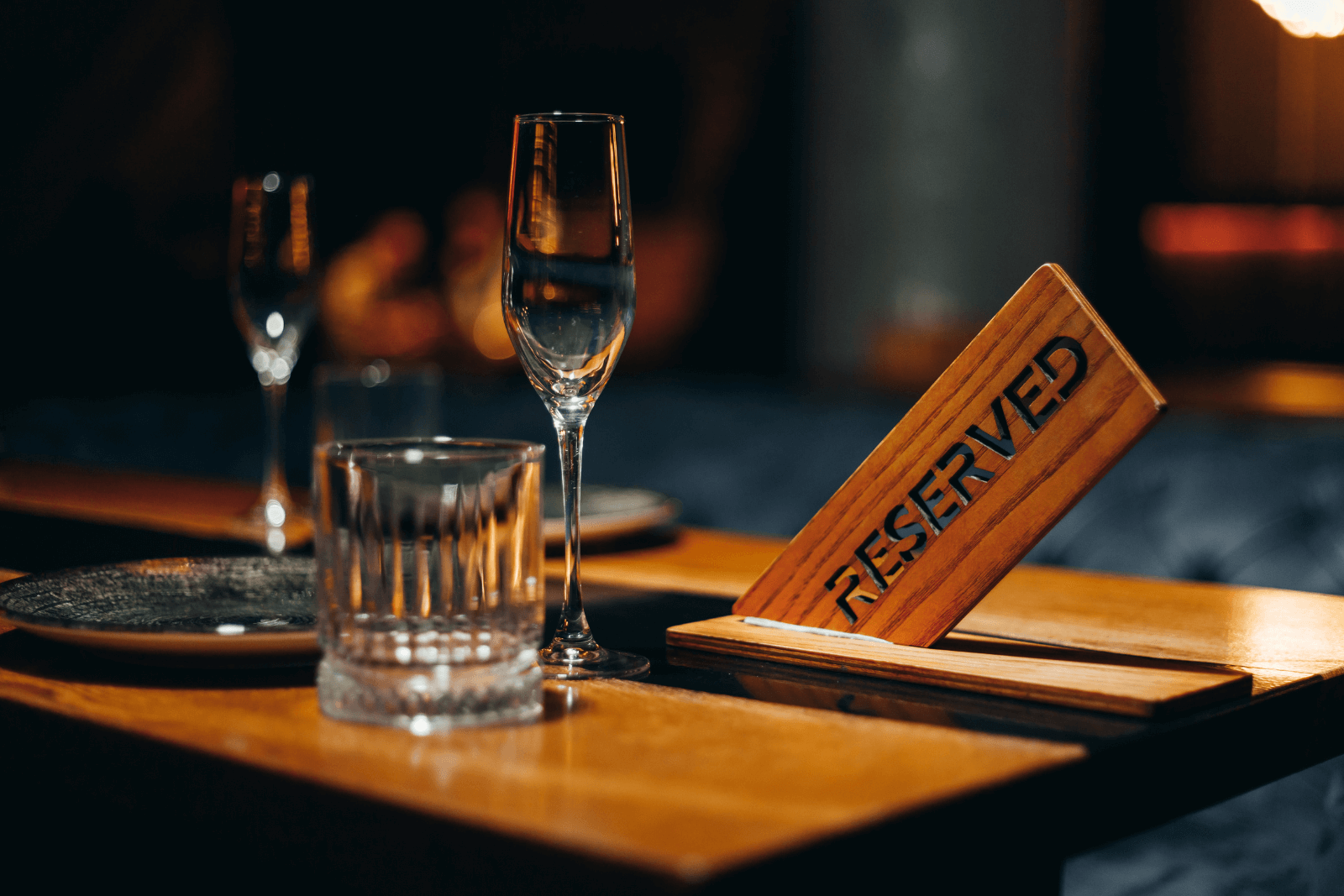
Have you ever landed on a restaurant’s website, only to give up because booking a table felt like a chore?
Chances are, your customers feel the same way.
A well-designed booking widget does more than take reservations. It convinces people to book a table right away.
Below, we’ll look at six real-life examples of booking widgets that win trust, look great, and make reservations effortless.
Use them as inspiration to create a smoother, more inviting booking experience for your guests.
Pink Mamma: Multilingual Pop-Up Widget
Paris-based Italian restaurant Pink Mamma is a masterclass in blending brand personality with practical booking tools.
Their booking widget sits neatly in the sidebar, styled to match the restaurant’s warm, rustic aesthetic.
The colors, typography, and layout look like they belong on that website.
Source: PinkMamma

That familiarity matters.
Design research shows that consistent branding across all touchpoints can increase revenue by up to 33%, a result often linked to the higher trust and confidence it creates among customers.
But what really sets PinkMamma’s widget apart is its multilingual capability.
Source: PinkMamma

If you run a restaurant in a tourist destination, you know that language barriers can cause hesitation.
Even if a visitor likes your menu, they may skip booking if the form feels confusing. With a simple language toggle, Pink Mamma removes that friction.
Another strength is its pop-up format.
Source: PinkMamma

It’s subtle but always accessible, letting guests start the booking process whenever they’re ready, without leaving the page they were browsing.
There’s no disruptive jump to another domain—just a smooth slide-in window that keeps the user focused.
To recap, here’s why this widget works well:
- Multilingual options capture bookings from international guests without extra staff effort.
- Consistent branding makes the booking flow feel like an extension of in-person hospitality.
- Pop-up widgets reduce drop-offs by avoiding external booking pages.
If your restaurant attracts international guests, a multilingual pop-up that reflects your brand style is a powerful way to make every potential diner feel welcome.
The Family: Multi-Step Simplicity That Drives Action
At The Family in Varaždin, Croatia, the dining experience combines a carefully designed ambiance celebrating the successes of Croatian football with a menu based on local ingredients.
Their reservation form shows that sometimes less really is more.
Source: TheFamily

The widget takes guests through just four quick steps:
- Select the number of guests
- Pick a date
- Choose a time
- Confirm the booking
That’s it.
No unnecessary fields, no requests for information you don’t need yet.
The simplicity is intentional as every extra click is a chance for a guest to abandon the process.
Each step appears on a clean, separate screen, which feels psychologically manageable.
Studies on web usability show that breaking tasks into small, clear steps can increase completion rates by 25% compared to showing everything at once.
For restaurants, that means more confirmed tables and fewer visitors leaving out of frustration.
The design also avoids distractions. There are no promotional banners or unrelated offers.
The interface focuses entirely on the task at hand, guiding users to the confirmation button without overthinking.
Source: TheFamily

This focus is crucial, especially for small and mid-sized restaurants, since many guests book on their phones and often in a hurry.
A complex form can quickly lead to abandonment.
By contrast, The Family’s widget feels natural, mobile-friendly, and consistent with the website’s clean, minimalist design.
Why it works:
- Fewer form fields mean less resistance to completing the booking.
- A clean, mobile-friendly design makes it easy to book on the go.
- Guided steps prevent errors and reduce no-shows caused by incorrect details.
To apply this principle, audit your own booking form.
Are you asking for information that could be collected later (such as special requests or dietary notes)? Consider making those optional.
The easier it is to confirm a table, the more likely guests are to complete the booking.
Bouillon: Seamless Integration With Brand Aesthetic
The Paris-based Bouillon group operates multiple venues but delivers a single, unified booking experience across all of them.
Guests can choose their preferred location from one unified widget without leaving the main reservation page.
Source: Bouillon

More than just being convenient, this is a lesson in brand consistency.
Everything about the widget (from the font to the spacing) matches Bouillon’s minimalist yet playful style.
Source: Bouillon

Consistency matters because the booking process is an extension of your hospitality.
A visual disconnect between your website and your booking form can make guests wonder if they’re still dealing with you or a third-party provider.
From a functional standpoint, Bouillon’s widget keeps the journey short. Guests select a location, choose a date and time, and confirm.
Source: Bouillon

There are no unnecessary loading screens, and the form works seamlessly on both desktop and mobile.
Here’s why it’s great for restaurants:
- A unified widget handles bookings for multiple venues or dining areas without creating confusion.
- Visual integration reassures guests that they are booking directly with you.
- Fewer steps keep the process fast, reducing booking abandonment.
If you run more than one restaurant, or even just separate dining spaces (like a terrace plus indoor), consider whether your booking tool can manage both in one smooth flow.
It saves time for guests and preserves a consistent brand experience.
Lokys: Minimalistic Booking Experience
Vilnius-based Lokys is one of the oldest restaurants in Lithuania, but its booking approach is thoroughly modern.
The widget is embedded directly into the site, allowing guests to book quickly without being redirected to a third-party platform.
The design is minimal: a date selector, time picker, and party-size field.
Source: Lokys

It also clarifies how to enter a phone number, including the country code.
That’s useful because when guests encounter unclear errors in a form, they often abandon the booking altogether.
On a Lokys’ website, guests can complete the process in seconds. And because the restaurant serves both locals and tourists, the form is multilingual, making it accessible to a wider audience.
In tourist-heavy markets, this kind of straightforward, accessible design is essential.
What makes it especially interesting is the contrast: although the restaurant itself is housed in gothic cellars and baroque rooms, the website is clean and modern.
Source: Lokys

That choice is deliberate.
A minimal, on-trend aesthetic appeals to today’s audience and works well on mobile. Many tourists check restaurant options on the go, often on Google Maps, and will book last-minute directly from their phones.
That’s why Lokys avoids unnecessary pop-ups or side menus that clutter a small screen. The booking flow stays clear and fast, reducing the chance of losing potential guests to competitors.
Why it works:
- Direct on-site booking keeps traffic on your website.
- A minimalistic layout reduces booking time and cognitive load.
- Multilingual support captures a broader audience without extra marketing spend.
To follow Lokys’ lead, ensure your booking widget works flawlessly on mobile devices and loads instantly.
According to an Akamai study, even a one-second delay in page load can reduce conversions by 7%, so speed matters as much as design.
La Capital: A Dedicated Booking Page With Reviews
La Capital, a Mexican restaurant in Vilnius, takes things further by dedicating an entire page to the booking process.
It’s powered by Tablein, our restaurant reservation system.
Source: La Capital

The page guides users through a smooth multi-step journey:
- Select time and number of guests
- Add contact details
- Confirm your reservation
And it looks like this:
Source: La Capital

The page appears almost instantly, and the clean, uncluttered interface makes each step feel intuitive.
Guests don’t have to search for buttons or second-guess their next action, which keeps the process flowing naturally.
What makes this setup stand out is the added context: guest feedback is displayed directly on the booking page.
Source: La CapitalLa Capital dashboard

Social proof is a powerful nudge. It reassures potential guests they’re making a good dining choice.
In this way, Tablein goes beyond simple functionality—its widget actively helps convince new visitors to book.
Another Tablein’s advantage is full customization.
Tablein allows restaurants to tailor the booking page to their own branding, avoiding the “generic portal” look common to many third-party systems.
Source: Tablein

The widget is quick to load, mobile-optimized, and responsive, ensuring no guest is lost to a clunky interface.
Alongside advanced customization, Tablein offers several useful features:
- Tracking where reservations come from (website, social media, or campaigns)
- Option to join a waiting list when tables are full
- Adding custom fields for allergies, occasions, or guest notes
- Reservation duration based on party size or daytime
And because the booking widget is integrated into the restaurant’s own site, guests never feel like they’ve been handed off to an unrelated system.
Why it works for restaurants of all sizes:
- A dedicated booking page gives space for extra trust-building elements like reviews, photos, or menu highlights.
- Customization ensures the booking flow supports your brand identity.
- Fast, smooth performance ensures guests don’t abandon the booking out of frustration.
With a solution like Tablein, you can create a booking experience that is both functional and brand-aligned.
By adding social proof and customization to the flow, you give guests the confidence to click “Book now” without hesitation.
Papa House: Local Platform Integration
Lithuania’s Papa House uses the local platform Meniu.lt to power its booking widget.
Even though it’s a third-party integration, the design remains consistent with the restaurant’s branding, and it’s fully responsive across devices.
Source: Menu.lt

For many small-to-mid restaurants, especially in regions where local booking platforms are widely used, this can be a smart move.
Guests who already trust and use the platform may be more likely to book if they see the familiar interface.
Like Tablein, Menu.lt also displays restaurant reviews directly in the booking flow.
Source: Menu.lt

In Papa House’s case, they have an overall rating of 4.2 stars from 96 Google reviews. But as you see below, the widget can also link reviews from Facebook and the platform itself.
Source: Menu.lt

When it comes to reviews, the more, the merrier. Showing ratings from multiple platforms amplifies social proof and builds credibility with a wider range of potential guests.
Some people trust Google reviews most, others rely on Facebook, and some prefer the built-in ratings on the booking platform.
By displaying them all, you’re covering more trust touchpoints and appealing to different types of customers.
It also signals that your restaurant isn’t just loved in one corner of the internet, but you’ve built a consistent reputation across multiple spaces.
Papa House has made the most of this by combining strong multi-platform reviews with a booking integration that’s seamless and responsive across devices.
The widget’s mobile optimization is particularly important: over 70% of restaurant searches now happen on smartphones.
A responsive, easy-to-use form means Papa House captures spontaneous bookings from guests already nearby.
Here’s why this also works:
- Leveraging a popular local platform can boost visibility without heavy marketing.
- Familiarity with the booking tool reduces hesitation for first-time diners.
- Maintaining brand consistency in third-party integrations keeps the experience professional.
So, if you partner with a local platform, don’t treat the widget as “set and forget.”
Check how it looks on your site, make sure it matches your brand, and test it on multiple devices to ensure it delivers the same smooth experience every time.
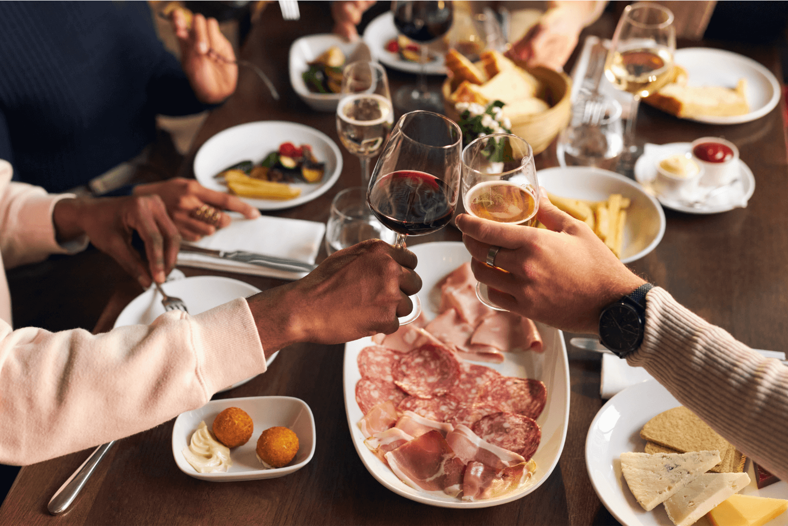
Conclusion
Your booking widget is so much more than a tool.
It’s part of a guest’s first impression of your restaurant.
Whether through multilingual support, a sleek and minimal design, or seamless brand integration, the best widgets make booking effortless and inviting.
Take inspiration from these six examples, and don’t hesitate to invest in a booking system that reflects your unique style.
The easier and more enjoyable it is to book with you, the more often guests will do it.
Share this
How to Increase Restaurant Reservations Using Your Website
How to Set Up Your Restaurant Booking System