Key Takeaways:
- 72% of guests visit a restaurant website before deciding where to dine.
- Consistent fonts, colors, and visuals help build trust and strengthen brand identity.
- Clear navigation and visible call-to-action buttons make it easy for guests to order.
- 89% of diners use mobile devices to research restaurants and browse menus.
- Embedded menus, photo galleries, and reservation tools improve website functionality and engagement.
Did you know that 72% of guests visit a restaurant’s website before deciding to dine in, and 91% do so before ordering takeout or delivery?
This staggering number shows that your website can make or break a reservation before guests even see your menu.
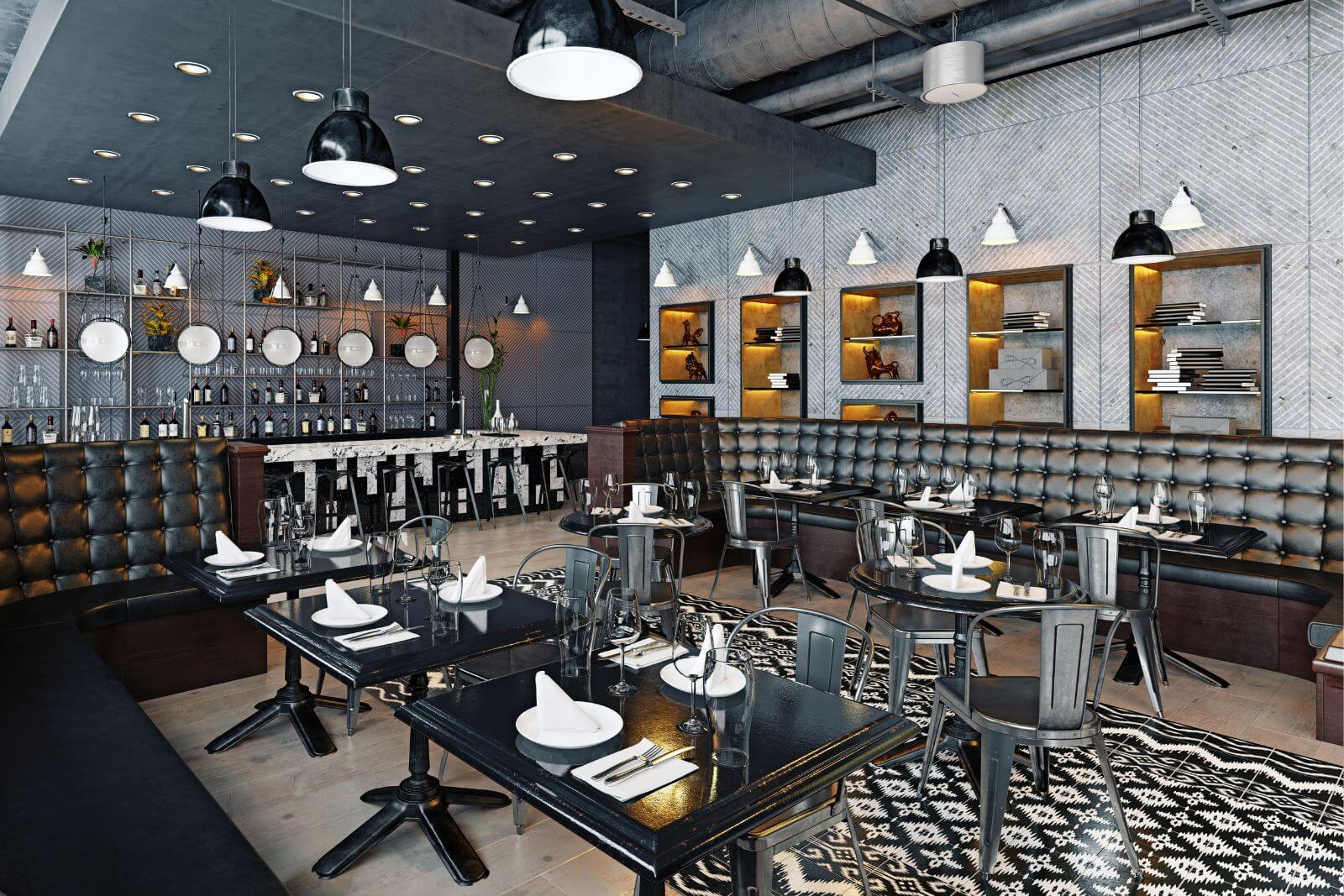
In today’s competitive dining landscape, your website is the digital front door.
Today, we’ll walk you through how to choose the perfect website template that turns clicks into conversions and conversions into customers.
Consider Your Business Goals
The first step in choosing the perfect restaurant website template is to clarify your business goals.
A template isn’t just a pretty frame.
It’s a functional tool designed to support your priorities, whether those are driving reservations, enabling online ordering, or simply showcasing your menu and atmosphere.
Why does this matter?
Because your website is often the first interaction guests have with your brand.
In fact, a survey by Owner reveals that 72% of guests visit a restaurant’s website before visiting in person.

Illustration: Tablein / Data: Owner
That means your choice of template directly influences whether guests take the next step or head to a competitor.
Selecting a responsive restaurant website template aligned with your objectives ensures the site becomes a marketing engine, not just a digital brochure.
Take the Westside Local in Kansas City, offering seasonal American dishes and hand-crafted libations, as an example.
Their business goal is likely to increase online orders from customers.
Why is that clear?
Because their website places a clear, bold “Online Ordering” button right in the header.

Source: The Westside Local
One click takes visitors straight to the menu, where prices and photos are clearly displayed—a direct nudge toward completing an order.

Source: The Westside Local
Hubbard Inn in Chicago, a multilevel tavern offering European-influenced dishes and old-fashioned cocktails, on the other hand, seems to promote brand awareness instead.
They feature a short video just under their website’s header that shows the experience guests can expect in the restaurant.
Source: Tony P’s Networking Events on YouTube
Scroll a little further and you’ll find not only delectable food shots, but also images of diners having fun, intricate table decor, and the restaurant’s stylish interior.
Their strategy is about making visitors “feel” the brand first, building an emotional connection before asking for a reservation.

Source: Hubbard Inn
You see? Different business objectives require different website choices.
For a small café looking to boost online sales or a gastropub aiming to fill tables, aligning template features like menu-first layouts and SEO optimization with clear business goals is essential.
In short, define your objectives first, then select a template that makes guest actions (reserve, order, explore) intuitive and engaging.
Define the Type of Website You Need
Not all restaurants need the same website structure.
A small café with a daily menu will have different requirements than an upscale fine-dining establishment or a casual eatery.
Defining the website you need—whether single-page or multi-page, static or dynamic—ensures your chosen restaurant website template aligns with your customer journey and brand style.
It shouldn’t just showcase your menu, but also guide users smoothly toward taking action.
Laura Kron, senior manager at US Foods, one of America's leading food distributors, agrees:

Illustration: Tablein / Quote: Bentobox
The choice of your website type matters because its structure impacts user experience and conversions.
According to Google, 88% of people are unlikely to return to a site after a bad user experience.

Illustration: Tablein / Data: Think With Google
This shows how little time you have to engage visitors. Your template must make it clear whether you want guests to reserve a table, order online, or explore your brand.
For smaller cafés, bars, or food trucks, a single-page website with a menu-first layout may be sufficient, giving guests all they need at a glance.
A strong example is Arts District Kitchen in Las Vegas.

Source: Art District Kitchen
It uses a single-page design that presents menus, locations, hours, and the restaurant’s story in one scroll.
For a neighborhood bar that relies on casual visits and foot traffic, this simple format works effectively.
In contrast, full-service restaurants or multi-location chains require multi-page, responsive restaurant websites with customizable layouts.
A strong example is Cafe Carmellini in New York.
They use a multi-page website that highlights not only reservations but also the chef's story, menus, and photos.

Source: Cafe Carmellini
This structure reflects the expectations of an upscale audience that wants to learn about the restaurant in detail before making a decision.
And here’s why this choice matters:
38% of millennials in the U.S. dine out 5 times or more in a month.

Illustration: Tablein / Data: SevenRooms
With diners this active, a poorly structured website can lead to significant missed opportunities.
Selecting the right template type early ensures your site reflects your restaurant’s identity, supports SEO, improves user experience, and increases the likelihood that visitors will become paying guests.
Match the Template to Your Branding
Your website’s template should also be an extension of your brand identity.
It should ensure a consistent customer experience from the first click to the last course, and consistency is what builds trust.
Consider these insights from the survey by Owner cited earlier.
72% of guests find restaurant information through a website, compared to 46% through social media.

Illustration: Tablein / Data: Owner
In other words, your site is the primary stage where brand perception is formed, so it must be attractive, polished, and unmistakably “you.”
Design consistency is a restaurant website element that matters more than many restaurants realize.
Matching fonts, brand colors, and clean layouts signal professionalism before a guest even looks at your menu.
Research backs this up.
A Clutch survey of 500 consumers found that 40% value good photos, 39% prioritize consistent colors, and 19% say typography carries the most weight.

Illustration: Tablein / Data: Clutch
This proves that visual design is not merely decorative—it directly shapes perception.
But what does an on-brand template look like in practice?
A fine-dining restaurant might use minimal, elegant design choices to reflect sophistication.
A family-owned restaurant could lean into warm, nostalgic visuals, and a family-oriented eatery might benefit from playful touches that create a welcoming atmosphere.
Take Le Bernardin as an example.
This Michelin three-star restaurant uses a pristine minimal design and muted color palette that mirrors the fine-dining experience it delivers.

Source: Le Bernardin
In comparison, Cali, a family-owned restaurant originally from Florida, greets visitors with storytelling visuals that highlight its heritage and personality the moment the page loads.

Source: Cali
Both approaches work because both match the brand’s identity.
To achieve this kind of consistency, you can use tools like Tablein.
Tablein is a restaurant-management platform that also includes website-building features.
These features allow you to apply your fonts, colors, and style across platforms such as WordPress or Wix, while also displaying essential restaurant information in a way that reflects your brand.
This can include:
-
Cuisine type and style
-
Customer reviews
-
Opening hours
-
Photo galleries
By customizing these elements, your website can communicate not just information but also your restaurant’s personality.

Source: Tablein
Tablein also provides customizable reservation widgets.
These can be styled to match your brand, ensuring that even the booking process feels like a natural part of your restaurant’s experience.
Whether you have a whimsical cafe theme or a high-end, elegant ambiance, you can integrate your branding into the booking widgets as shown below, so guests can get a consistent experience throughout.

Source: Tablein
A consistent look and feel—from the homepage to the reservation form—reinforces trust and encourages conversions.
Choose a User-Friendly Layout
A clean, user-friendly layout ensures visitors can quickly find what matters most: your menu, reservation options, and contact details.
If guests have to search too long for basic information, chances are you’ve already lost them.
Why is this so important in hospitality?
Because hospitality is all about ease and clarity.
Your website should mirror the same seamless service you provide in person.
That’s why navigation is the most important website feature for the majority of people.

Illustration: Tablein / Data: Clutch
Andy Crestodina, Co-founder of Orbit Media Studios, explains what ideal navigation looks like:

Illustration: Tablein / Quote: HubSpot
If essential options like your menu or “Book Now” button are buried, guests get frustrated and leave.
Streamlined navigation with visible menu bars and clear calls-to-action, such as “Reservations,” creates a smooth guest journey.
In addition, your website should reflect the specific needs of your guests.
For example, 39% of diners look for a sister restaurant if they don’t get a reservation.
If you own multiple restaurants, consider adding links to sister locations in your navigation.
Now that we’ve seen why user-friendly design matters, let’s look at real-world examples.
Sweetgreen, an American fast casual restaurant chain that serves salads, excels at this.
With clear, visible navigation that highlights menu options, ordering, and locations, guests move seamlessly from the homepage to ordering.

Source: Sweetgreen
On the other hand, Hildegard’s, a German restaurant in Huntsville, Alabama, shows what not to do.
Their homepage looks outdated, resembling a blog from the mid-2000s.

Source: Hildegard’s German Cuisine
Moreover, they have wasted the header image space. There’s no need for the brand name since they already have the logo on the header.
The navigation repeats both “Locations” and “Athens Locations”, which creates confusion.
Plus, the brand’s story is presented in long text blocks that discourage readers.
These missteps highlight the importance of keeping the layout clean and intuitive.
Here are four essential guidelines for a user-friendly layout:
|
Guideline |
Effect |
|
1. Place critical actions like “Reserve a Table” and “Order Online” above the fold. |
Guests quickly see the next step and are more likely to book or order. |
|
2. Embed the menu directly on the website instead of linking to a PDF. |
Improves accessibility and saves visitors from the hassle of downloads. |
|
3. Avoid full-screen menus; keep navigation in the top section only. |
Prevents overwhelming users and keeps the browsing experience simple. |
|
4. Use contrasting link colors that stand out from the background. |
Enhances readability and avoids confusion, especially for mobile visitors. |
A confusing layout silently drives guests away. They may not complain, but they won’t return.
A well-structured layout, by contrast, guides visitors naturally from browsing to booking or ordering.
Optimize for the Mobile Experience
Mobile optimization is more important than ever.
Guests now research, browse menus, and even make reservations from their phones.
That makes mobile optimization one of the most effective ways to increase reservations and online orders.
The numbers say it all.
89% of consumers use mobile devices for dining research, and, according to a DoorDash report, 60% of all digital restaurant orders are now placed via mobile.

Illustration: Tablein / Data: Think With Google, DoorDash
Put simply, if your website doesn’t adapt to small screens, you’re turning away the very guests most likely to convert.
So what does strong mobile design look like?
It includes responsive layouts, shorter text blocks for readability, and intuitive navigation like tap-to-call buttons or clickable logos that return visitors to the homepage.
On the other side, poorly optimized templates frustrate users with excessive zooming and scrolling, leading to abandoned visits and lost revenue.
Take Tucker’s, a beloved breakfast and lunch spot in New Hampshire, as a best-in-class example.
Its sticky footer navigation keeps “Menu,” “Locations,” and “Order Online” links accessible at all times, eliminating unnecessary scrolling.

Source: Tucker’s
This is complemented by responsive layouts that resize images and text blocks appropriately for mobile screens.
Features like the intuitive menu logo and the “Back” button make browsing effortless. Guests can explore options or place an order in just a few taps.

Source: Tucker’s
In contrast, websites like Hildegard’s German Cuisine struggle with mobile optimization.
Its cluttered design and text-heavy layouts force users to scroll excessively, creating friction in the booking process.

Source: Hildegard’s German Cuisine
Small images and excessive spacing between text blocks further reduce visual appeal and usability.

Source: Hildegard’s German Cuisine
While the food may be authentic, the online journey feels outdated, and that discourages potential visitors from engaging further.
At the end of the day, you don’t want your website to be wasting opportunity drop by drop, like a leaky faucet.
A responsive, mobile-optimized website is now a business necessity.
With features like clear CTAs, reservation-enabled functionality, and responsive layouts, you transform your website into a digital extension of your front-of-the-house, ensuring guests enjoy the same seamless journey from browsing to booking.
Conclusion
A perfect restaurant website template isn’t just about looks, but function and identity working together.
From defining your business goals to aligning branding and mobile experiences, every choice you make shapes how guests perceive and interact with your restaurant.
So don’t settle for a “pretty” site that does nothing for your bottom line.
Pick a responsive, guest-focused template that turns visitors into diners and diners into regulars.
Invest in your website today, and it will keep paying you back, plate after plate, guest after guest.
Share this

5 Ways to Increase Restaurant Sales
How to Make Your Restaurant Stand Out from the Competition