As a restaurateur, you are well aware that your competition is everywhere.
So, what are you doing to make sure diners choose your restaurant over the one next door?
Great food, a cozy ambiance, and a dedicated staff—these days, that’s just the starting point.
To truly stand out, you need something more.
That something is branding.
Branding is how you tell your story, show off your personality, and make a lasting impression on everyone who comes across your restaurant.
In this article, we showcase six restaurants that have truly mastered the art of branding.
Each example highlights a different branding element, like visual identity or brand voice, serving as both inspiration and a practical checklist to help you craft a brand that’s uniquely yours.
The Dinner Ladies: A Striking Visual Identity
The Dinner Ladies is an Australian online meal delivery service that specializes in pre-made, frozen meals.
At first glance, the name might make you think of hairnets and school canteens—but don’t be fooled.
The brand, launched by two Sydney mums back in 2007, is anything but dated or “mumsy.”
Just look at their visual identity.
Developed by design studio Universal Favourite, it’s bold, authentic, a bit edgy, yet still warm and inviting.
According to the studio, this was exactly the goal:
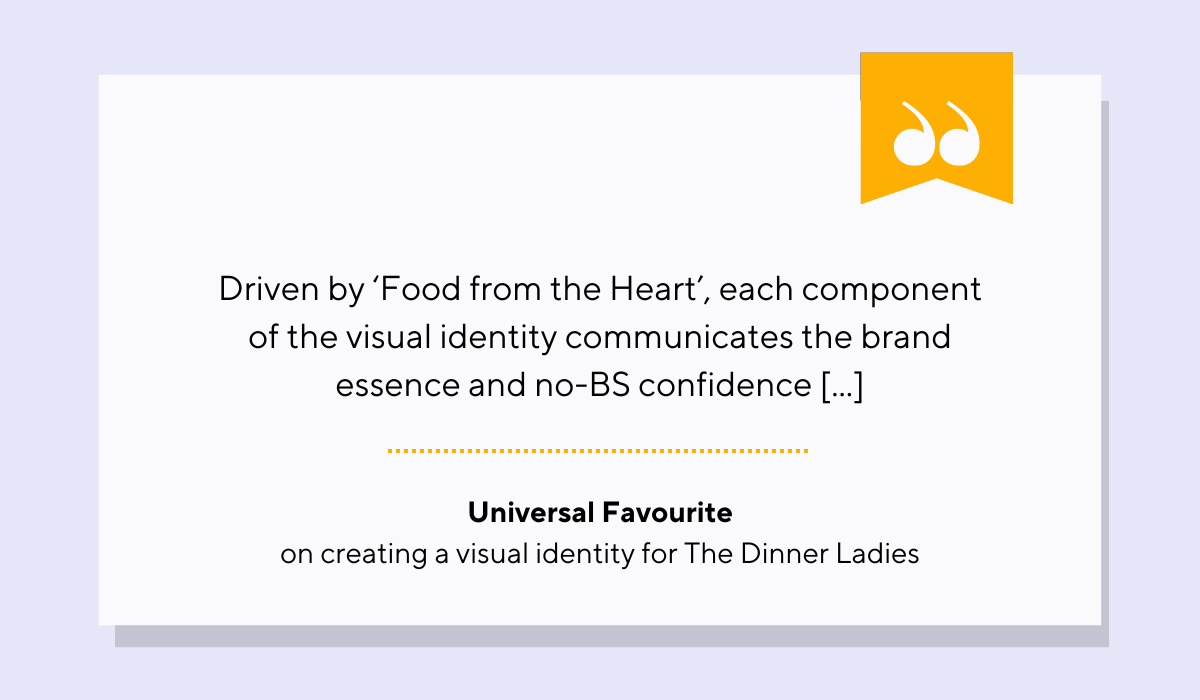
Illustration: Tablein / Quote: Universal Favourite
The first thing that grabs your attention is the color palette.
The Dinner Ladies’ signature red is striking, and it's supported by a secondary palette of warm, approachable, slightly retro hues:
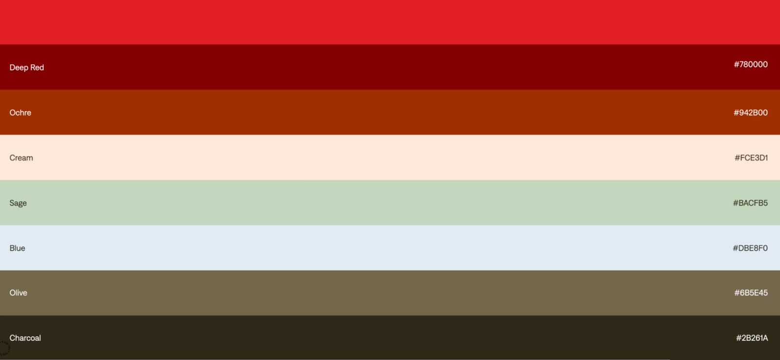
Source: Universal Favourite
Together, these colors unlock a wide range of vibrant combinations, especially effective across digital touchpoints where visual consistency and standout design are a must.
Typography also plays a critical role in defining the brand.
Universal Favourite selected ‘Denim’ by Displaay Type Foundry, a typeface that perfectly balances confidence with clarity.
Denim Wide is used for headlines and calls to action, delivering a punch of personality, while the regular cut is clean and highly legible, making it ideal for subheadings and body copy.
Source: The Dinner Ladies
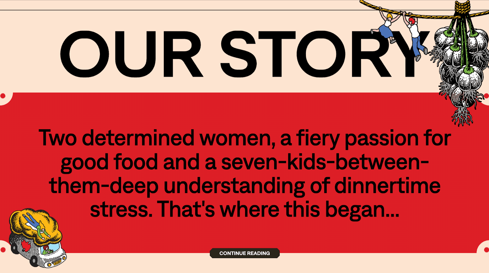
And let’s not forget about illustrations, another key pillar of the brand’s visual identity.
Drawing inspiration from traditional tattoo art, the illustrations are bold, colorful, and packed with character, much like the founders themselves.
They bring storytelling to the forefront and help convey the passion and care baked into every meal.
Source: Universal Favourite
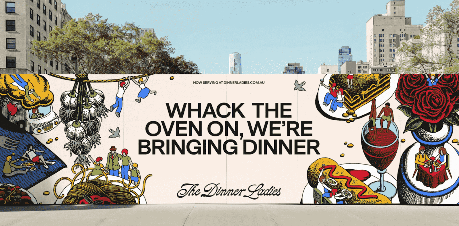
Put it all together, and you’ve got a brand that feels modern, real, and just a little rebellious.
It’s the type of branding that makes you feel something, and in a crowded market, that’s precisely what works best.
Pizza Jerk: A One-of-a-Kind Brand Voice
You can’t talk about unique branding without mentioning Pizza Jerk, a pizzeria from Portland, Oregon.
From the moment you land on their website, it’s apparent this isn’t your typical pizza place.
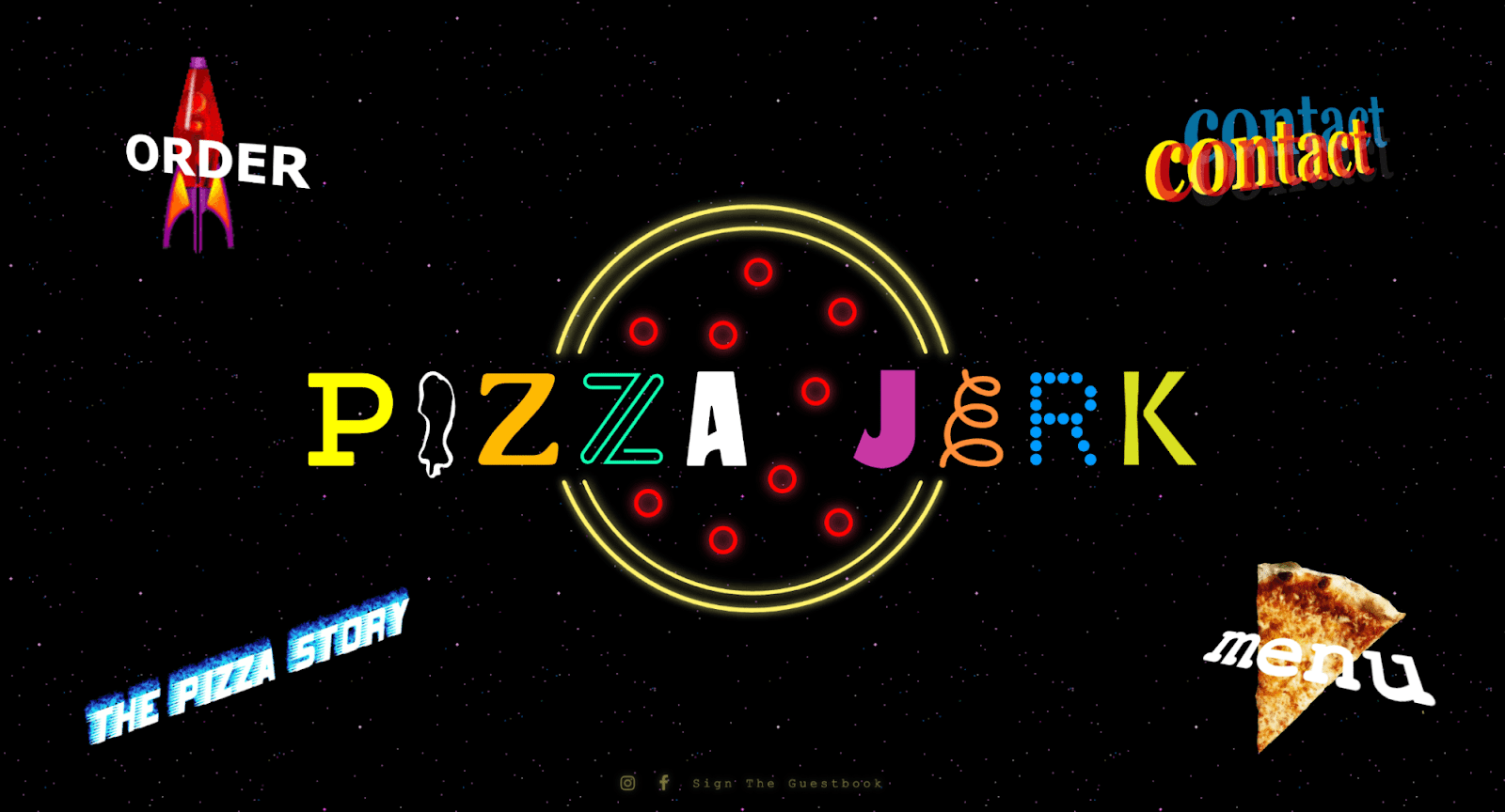
Source: Pizza Jerk
But what sets them apart isn’t just the over-the-top visuals.
It’s their bold, irreverent brand voice that immediately grabs your attention.
Let’s start with the name itself: “Pizza Jerk.”
It’s cheeky, memorable, and a little rebellious, setting the tone before you even step through their door.
That tone is carried through their website, too.
Just take a look at this excerpt from their “The Pizza Story” page:
“Pizza is Nature’s most perfect food. We love Italy, and we love that people think pizza is Italian. But pizza belongs to America. We care more about it. We eat more of it, for dinner, for lunch, and for breakfast. Pizza is the best food for sharing. Good pizza is really-really good, and Pizza Jerk aims for a perfect pizza every time.”
There’s a clear pride in their craft, but without a hint of pretension.
Lines like “Pizza is Nature’s most perfect food” strike the perfect balance between passion and playfulness.
You can almost hear someone saying it out loud, maybe while tossing dough behind the counter.
Their social media follows suit—casual, offbeat, and full of personality.
They steer clear of anything too polished or corporate, instead opting for a voice that feels much more authentic.
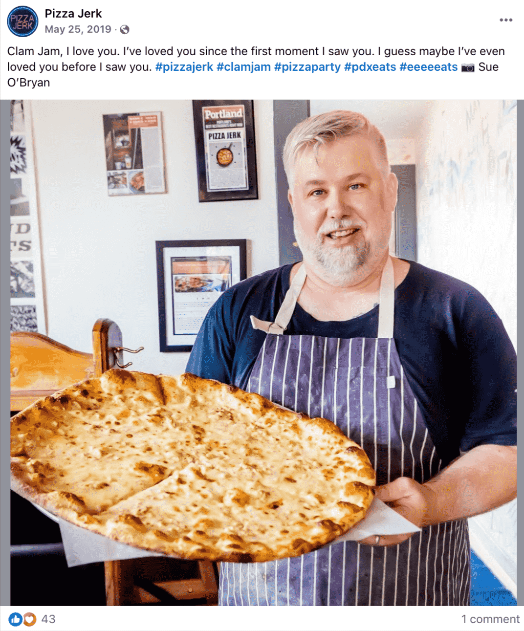
Source: Pizza Jerk on Facebook
It’s the kind of tone that feels like a friend cracking jokes, not a marketing team behind a desk.
Sure, their visual identity—logo, typography, color palette—is unique as well.
But Pizza Jerk doesn’t just look different. They sound different.
Their voice communicates exactly who they are: bold, fun, and unapologetically themselves.
And that’s what makes their branding so unforgettable and appealing.
Dishoom: Captivating Storytelling
Another important element of branding is storytelling.
While brand voice is how your restaurant "speaks," storytelling is what your restaurant is actually saying—your history, mission, values, and emotional appeal.
Dishoom, a British chain of Indian restaurants, truly excels at this. Storytelling sits at the heart of their brand.
Their tagline, “From Bombay, with love,” permeates every touchpoint, evoking the charm and nostalgia of Bombay cafés from the 1940s.
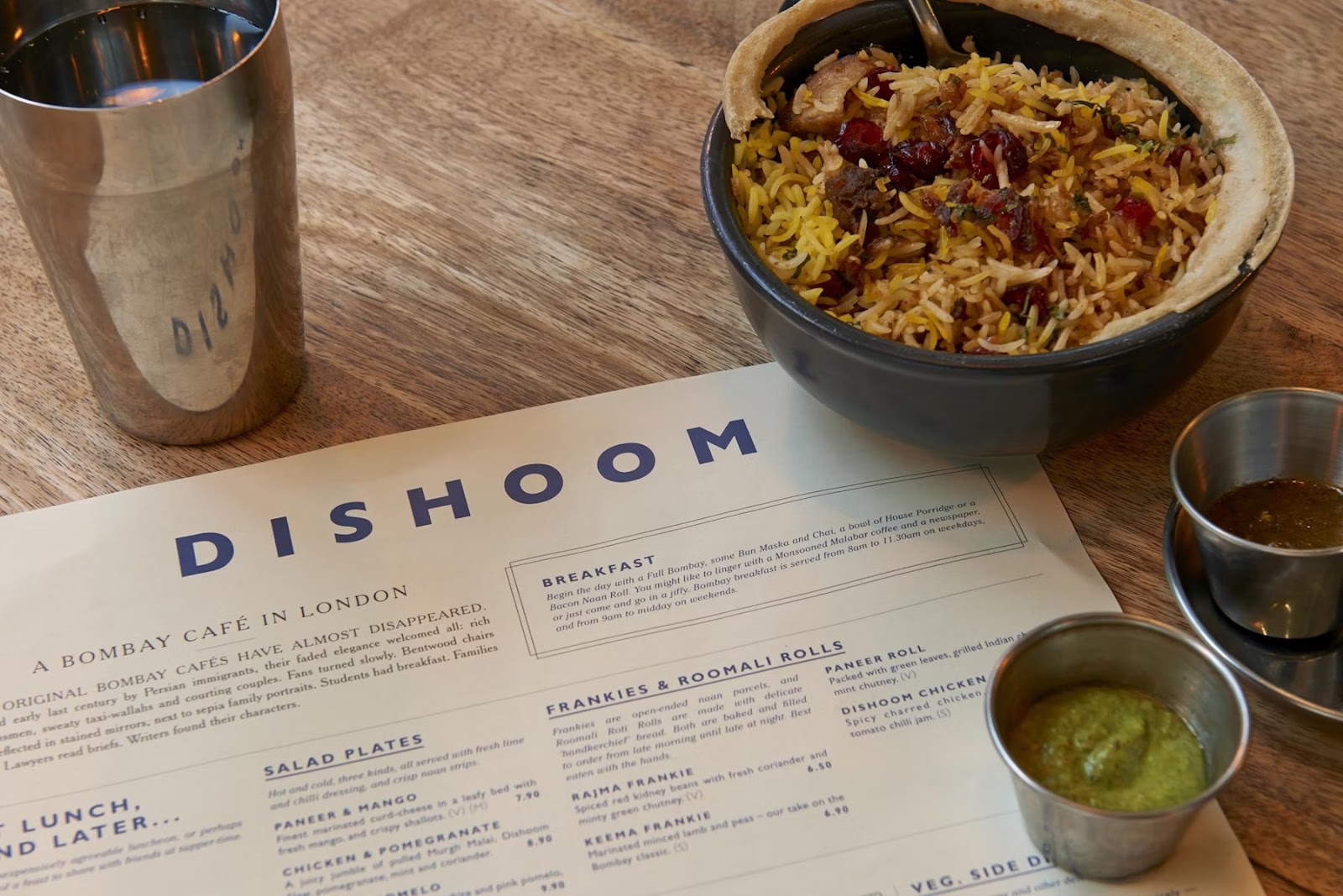
Starting with the food, Dishoom uses its menu as a powerful storytelling tool, with each item having a backstory or fitting into a broader cultural narrative.
Here’s just a portion of their breakfast menu:
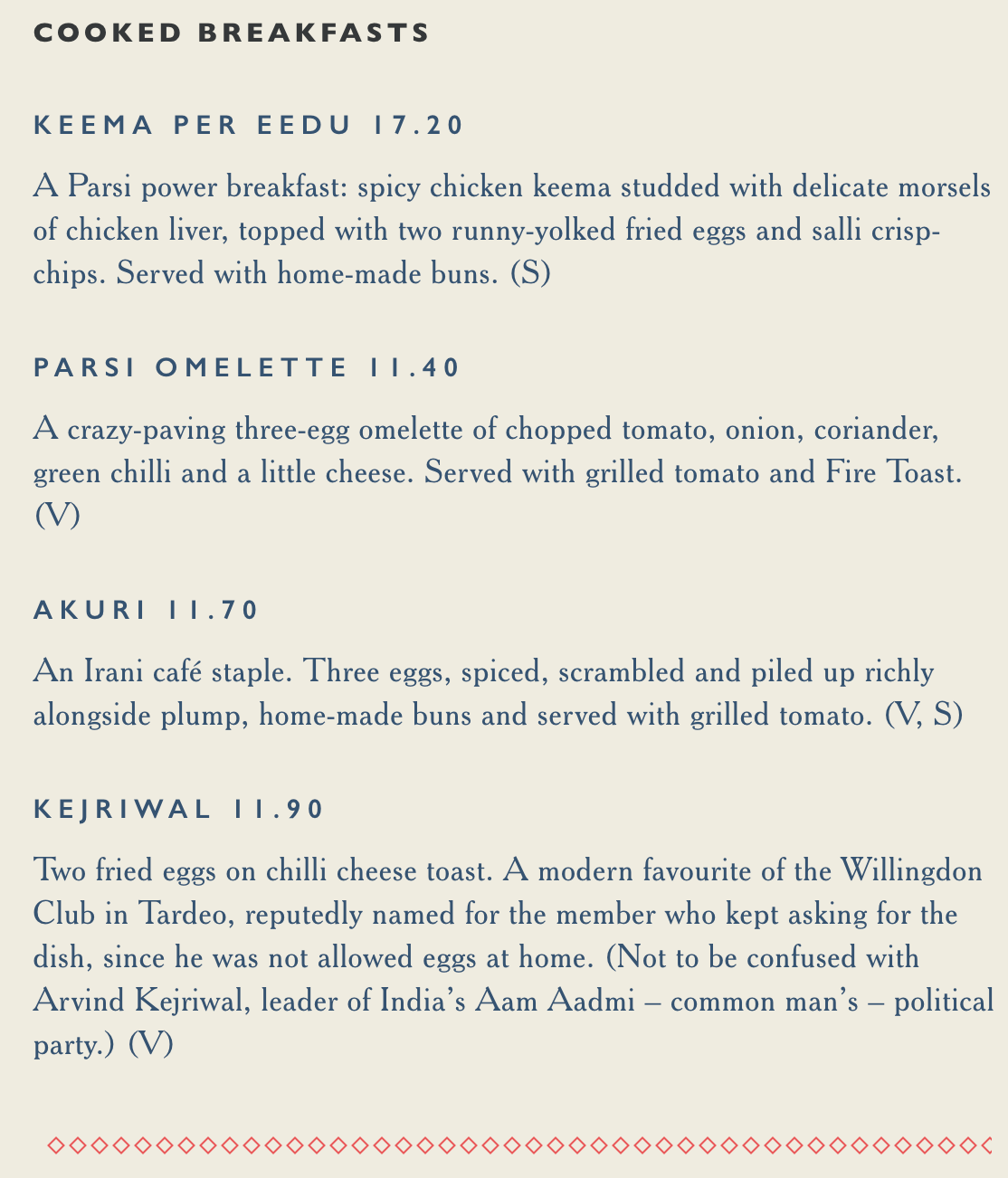
Source: Dishoom
At Dishoom, you’ll find the food of all Bombay, from its cafés and grills to street stalls and homes. It’s nostalgia served on a plate.
Visual identity also plays a major role in their branding.
& Smith, the creative agency behind Dishoom’s branding, approached the project by imagining themselves at the center of Dishoom’s narrative:
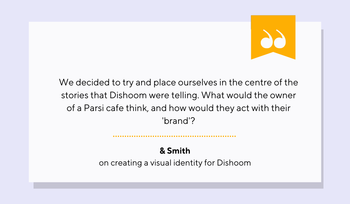
Illustration: Tablein / Quote: & Smith
Their design drew inspiration from vintage Indian trains and old Bombay style, infusing it into every detail of the restaurants.
Source: & Smith
They even collaborated with Kalapi Gajjar-Bordawekar, an expert in Indian typefaces, to ensure the visuals are authentic.
But it’s the interiors that truly bring the story to life.
Each Dishoom location is built around an imagined main character, with a unique backstory.
Take, for example, the King’s Cross restaurant.
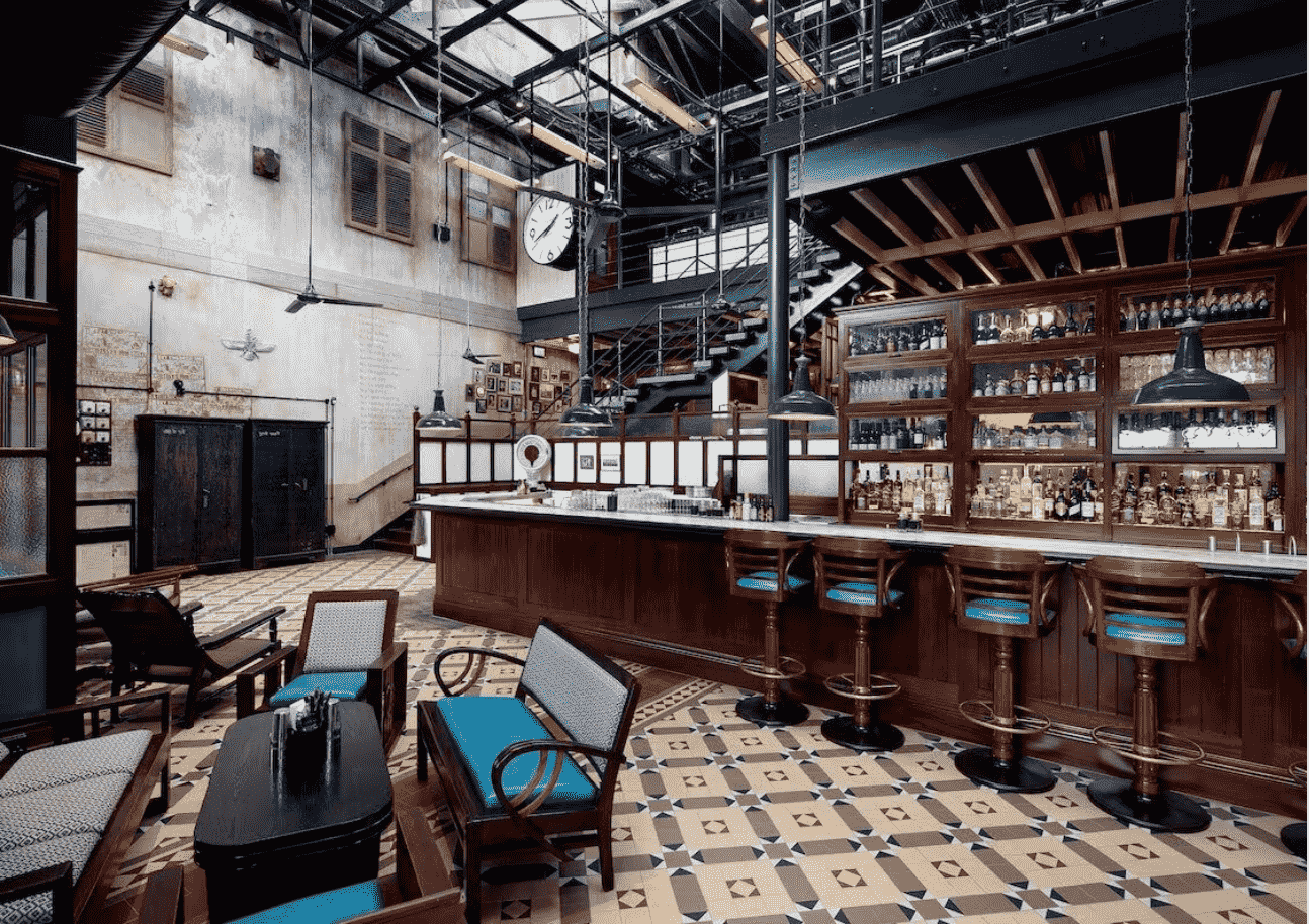
Source: Dishoom
Co-founder Shamil Thakrar shares the imagined origin:
“In essence, we imagine a young Irani man who comes into a goods shed near Victoria Terminus, in 1928 [...] We imagined that this guy sees these men, and machines, and commerce, and horses, and languages, and says to himself; ‘I can sell them some chai.’”
So he bribes a guard, sells chai, comes back the next day with pots and pans, and gradually sets up a seating area. Twenty years later, he’s taken over the whole place.
And that’s how the King’s Cross restaurant came to be.
In short, Dishoom set out to create an immersive brand narrative—one that flows through their service, menu, design, ambience, and website.
And they succeeded.
Subtly exotic yet unmistakably urban, Dishoom stands apart from typical UK Indian restaurants.
It avoids the clichés, instead celebrating the overlooked beauty of everyday India.
Their story feels personal, specific, and rooted in truth.
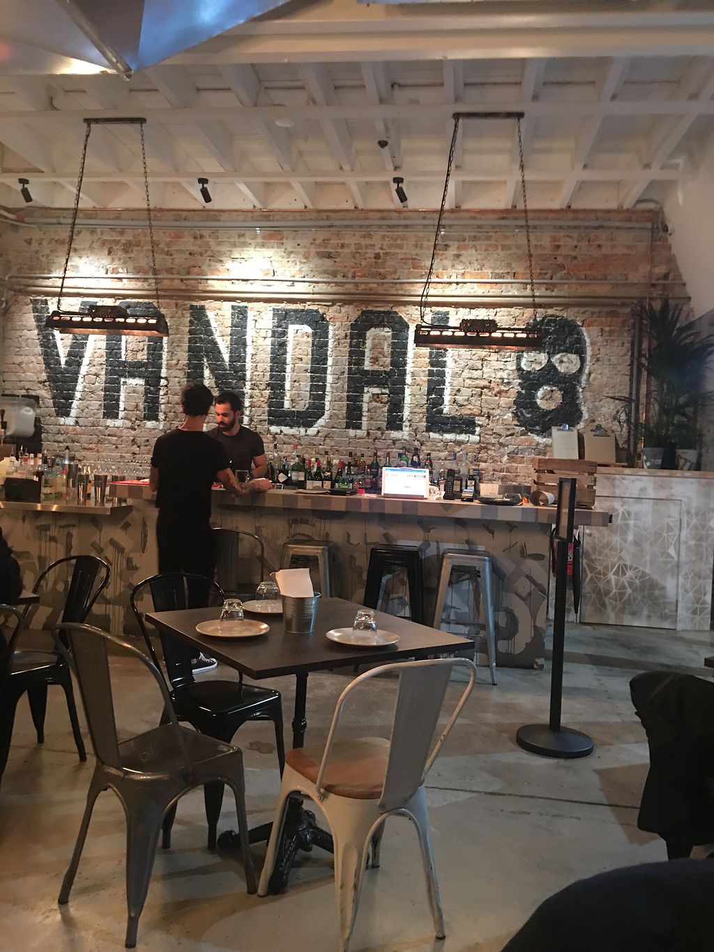
Vandal: Interior Design as Brand Expression
That’s right, your restaurant’s interior is another vital part of your branding.
Vandal Taqueria, Sydney’s plant-based restaurant, understands this very well, and takes full advantage of it.
According to their website, Vandal is an homage to the Latino food trucks of Los Angeles, rejecting tradition or any kind of label.
And you can tell.
From the moment you walk into their restaurant, the space makes a statement.
Vibrant graffiti covers the walls, even spilling into the kitchen, aligning perfectly with the name “Vandal.”
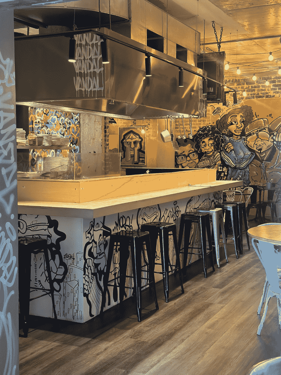
Source: Vandal Taqueria
The artwork injects a raw, youthful energy into the space and resonates with a crowd that values individuality, street culture, and authenticity.
The graffiti and street-style art also reflect the hand-painted signs, murals, and tags often seen on L.A. taco trucks and the neighborhoods they serve.
The layout is big, open, and full of natural light, evoking the L.A. street scene.
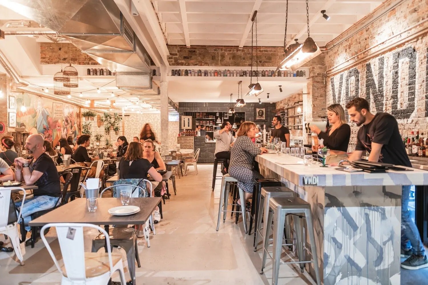
Source: SevenRooms
Food trucks in Los Angeles often park in open lots or along busy sidewalks, creating informal gathering spots where people stand, eat, and socialize.
Vandal’s open-plan design mimics that vibe, bringing the casual, free-flowing atmosphere of a taco truck corner indoors.
There’s also plenty of exposed brick and a hint of industrial flair.
These elements lend the space a sense of rawness and honesty, giving it a “built-from-the-ground-up” feel.
Source: HappyCow
The brick adds texture and warmth, grounding the boldness of the graffiti and vibrant décor.
Meanwhile, metal finishes, open ceilings, and visible ductwork contribute to that unpolished, functional aesthetic—much like a food truck’s no-frills setup.
Every detail in the space tells their story.
Vandal isn’t just about vegan tacos; it’s about breaking the rules, having fun with flavor, and bringing people together.
And their space completely embodies their spirit.
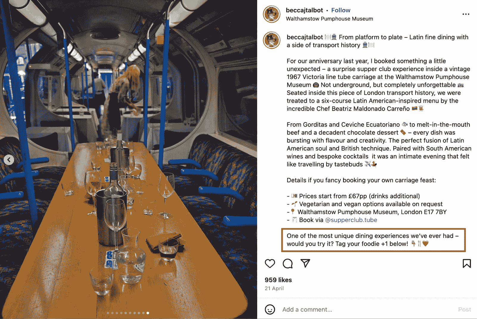
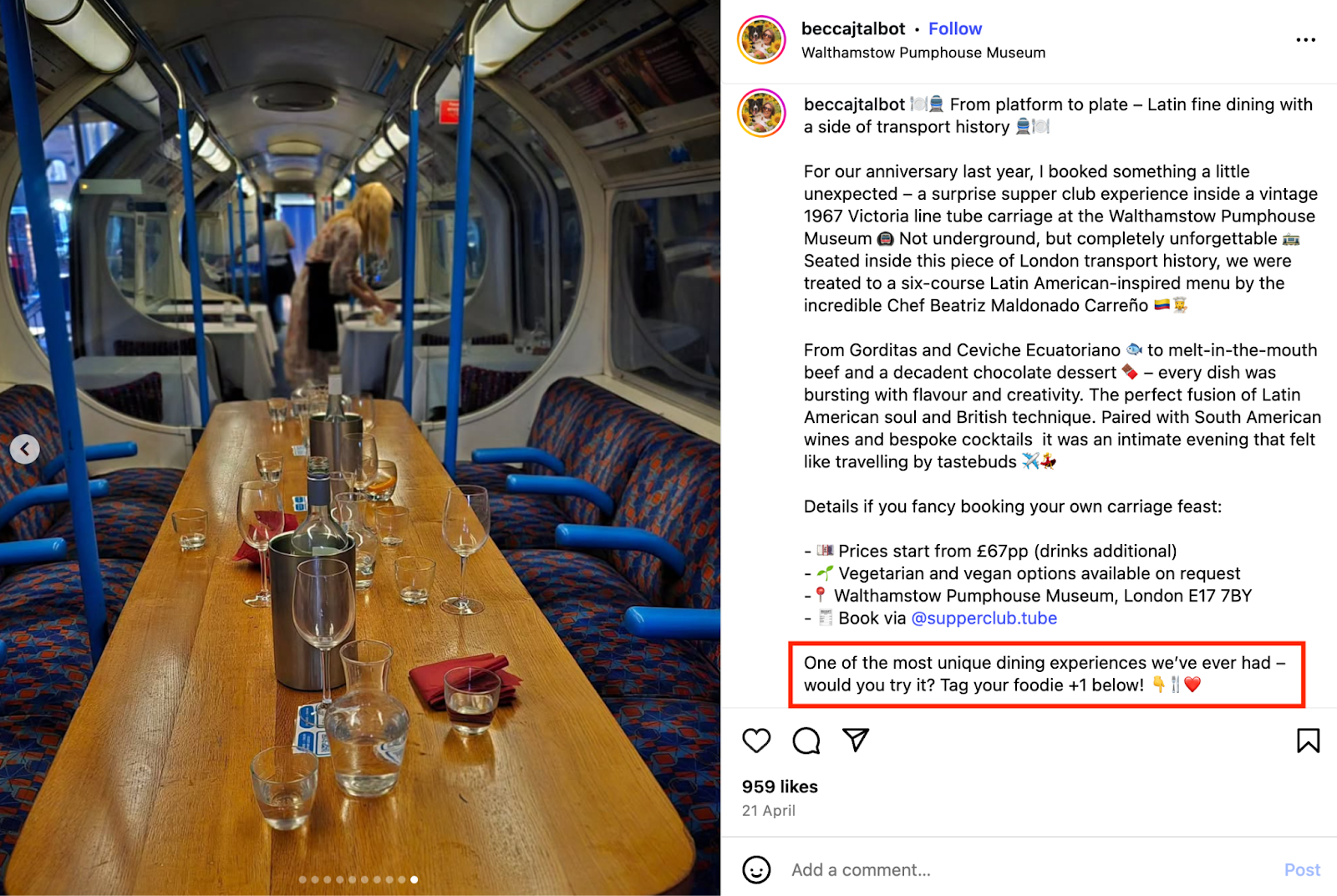
Supperclub.Tube: A Unique Concept
The experience your restaurant offers speaks volumes about your brand, too.
And with thousands of restaurants competing for attention, a novel concept can set you apart instantly.
Supperclub.Tube knows this better than anybody.
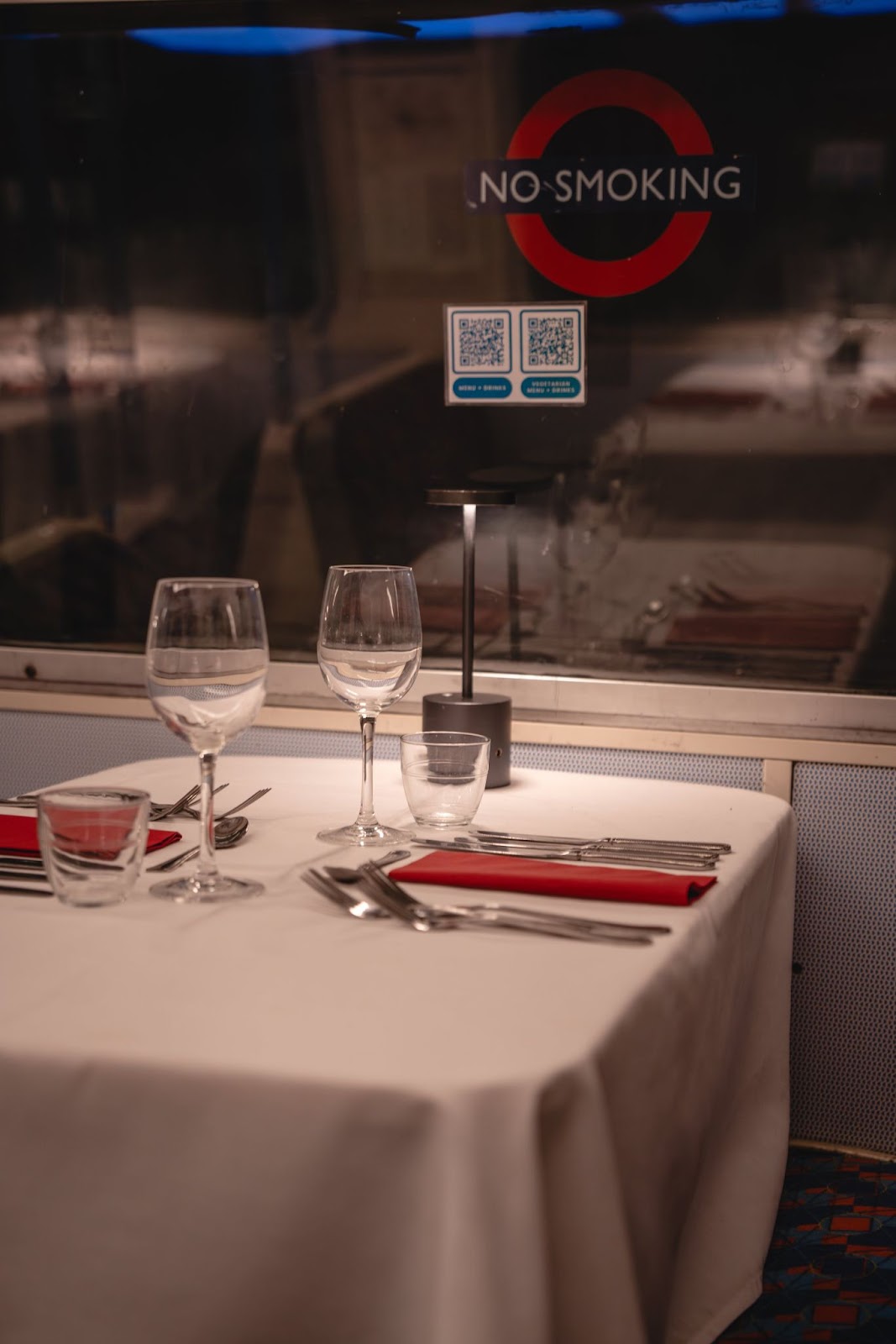
Tucked inside the Walthamstow Pumphouse Museum in London, Supperclub.Tube serves up a dining experience like no other: onboard a 1967 Victoria Line Tube carriage.
Yes, an actual decommissioned train.
Source: Flo London
Three nights a week, this historic train is transformed into an intimate Latin American supper club serving a six-course tasting menu.
You have to admit, “Dine on the Tube” is far more memorable than just “modern Latin tasting menu.”
And branding is all about standing out.
With all the original features of the carriage preserved, the setting feels authentic and immersive, complete with white linens, fine silverware, jazz, and beautifully plated food.
Source: Flo London
Supperclub.Tube couldn’t have launched at a better time.
In the social media era, where eye-catching photos and videos dominate, the experience is made to be shared.
Each guest who posts an image or reel becomes a micro-ambassador, spreading the word organically.
Source: beccajtalbot on Instagram
And really, who wouldn’t want to say they had dinner on the Tube?
The concept is just the right kind of unusual to be completely unmissable.
Remember, people love to talk about novel experiences.
A unique concept gives you a story to tell—and one customers will want to retell.
Noma: Values-Led Branding
Can your beliefs shape your brand?
Copenhagen’s noma proves they can.
This three-Michelin-star restaurant has built its entire brand around a set of clear values—nature, sustainability, and craftsmanship.
And those values shape everything they do.
You can see it right from their visual identity, which embraces Scandinavian minimalism: clean lines, spacious layouts, and a restrained use of color.
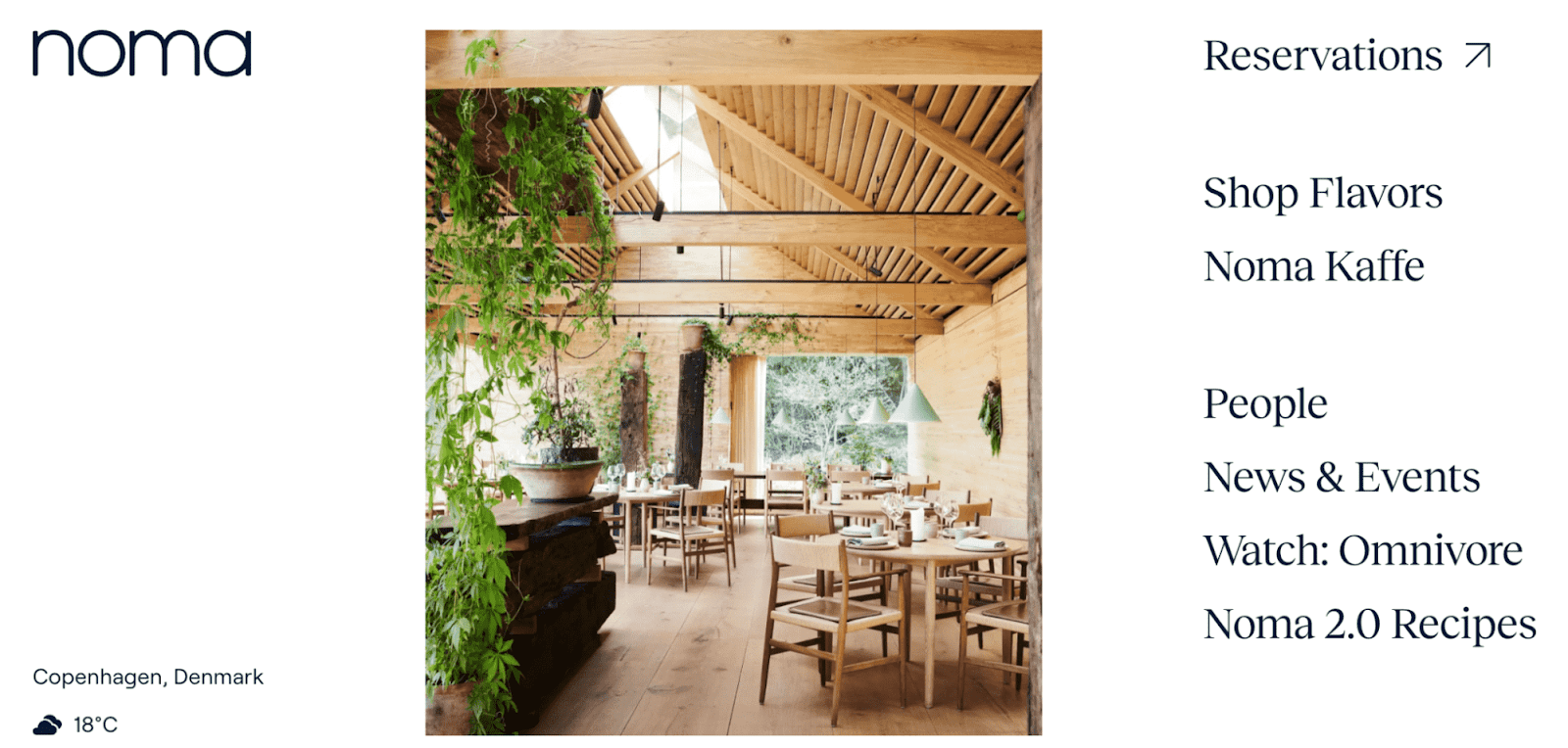
Source: noma
Even the organic typeface used in their logo draws inspiration from natural shapes.
Nothing ever screams for attention—because nothing has to.
Food and nature are the only things that matter.
These values extend into the restaurant’s physical space.
Guests are welcomed through a greenhouse lush with plant life before entering beautifully designed dining areas filled with natural light, wood, and greenery.
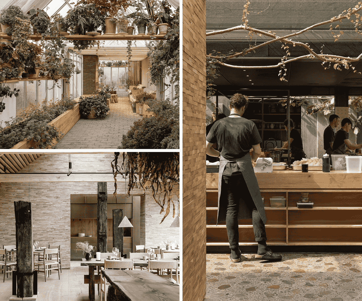
Source: David Thulstrup
It’s calm and understated, but every detail reflects a bigger idea: that dining should feel connected to the natural world.
The food tells the same story.
Everything is local, seasonal, and sourced sustainably.
Noma works closely with farmers, foragers, and fishermen to get the best ingredients with the lowest environmental impact.
Even how the food is presented ties back to nature.
One dish, for example, hides steamed king crab beneath a bed of leaves, served with a flower to “paint” on the sauce.
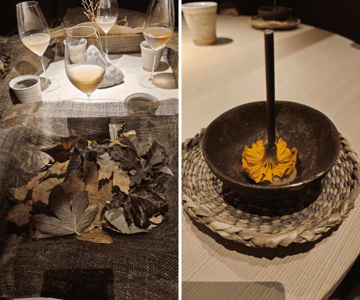
Source: Food Finance Travel
It’s thoughtful, creative, and very much in line with the brand.
At noma, the branding isn’t just visual—it’s woven into every part of the experience.
From the logo to the ingredients, everything connects back to what they believe in, creating a distinctive and clear identity that’s instantly recognizable.
Conclusion
Branding is about much more than just sleek logos and beautiful color palettes.
When done well, it's a powerful tool that tells the world exactly who you are—it builds loyalty, sparks conversations, and makes you unforgettable.
Hopefully, these examples have shown you what’s possible, and inspired you to start shaping your own unique brand.
Just take your time, connect with your core values, communicate them clearly, and let diners fall in love with your story.
Share this

5 Reasons Why Strong Restaurant Branding Matters

Which Digital Channels to Leverage for Building Your Restaurant's Brand
